My Brand Reveal!
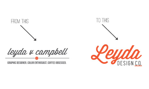
You guys. I finally finished my rebrand! Well let me clarify. I finished my visual rebrand but I’m still working on lots of other tweaks and changes behind the scenes (business cards, updating my etsy shop so it’s consistent with my branding ect). I was going to share little glimpses here on how things are going but I’ve been working on it for so long and I’m too excited not to share! If you’ve visited my site before you might already be noticing some changes like the new logo and social media buttons. I’m slowly updating things here so everything looks and feels consistent. So here is a side by side of my old and new logo.

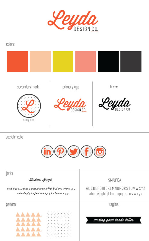
I stuck with the font, Wisdom Script, that I used in the old logo but otherwise I went in a different direction. No tagline, different colors, and a tighter more finished design. I have to admit that I absolutely love the new logo! Here’s my full brand style sheet so you can see all the elements together:

I’m not going to lie. This was a lot of work. I wanted to make sure that I didn’t rush things and I really went through the process slowly and methodically. I highly recommend that if you decide to rebrand your business or are starting something new, take your time. It’s so worth it to do things right. I’ll be writing a more in-depth post about the specific hows and whys for this rebrand coming soon.
Tomorrow I’ll be doing the next installment in the building your brand series so make sure to stop back! I’m also working on some new prints for my shop in time for the holidays. So much new!


