Leyda Design Co branding: A Case Study

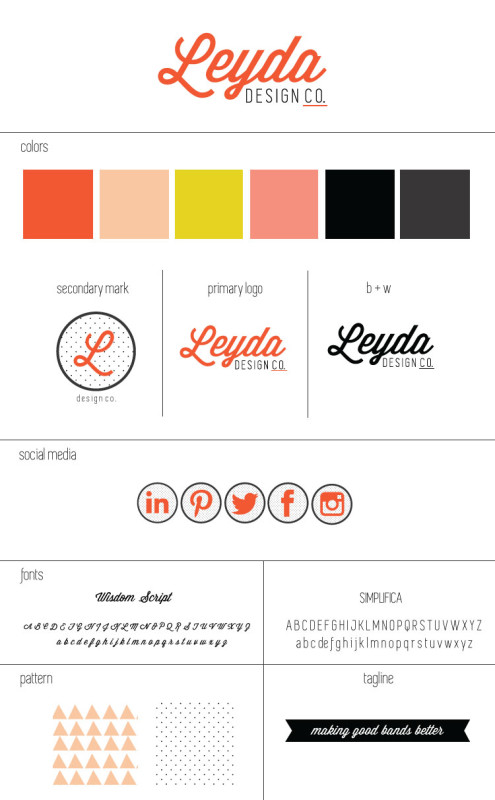
I promised that I would go more in-depth regarding my personal rebrand for Leyda Design Co. so here it is! Here’s my current branding style sheet:

I’ll take you through why I chose what I chose and why having a niche makes branding so much easier. If you have a business I hope you have at least a good logo. If you don’t contact me and I can help with that  Anyway, it’s so important that you take your time developing a solid brand that you won’t hate or be tired of a year from now. What I’m showing you are the visual components of my brand but don’t forget that there is so much to a brand than a logo or visual elements.
When I started my process I knew the first thing I needed to do was find my niche. I was always afraid to narrow my scope, worried that if I wasn’t for everybody that I would be losing business. Here’s a secret: you will never appeal to everyone no matter what you do. And you shouldn’t try. You need to focus your efforts on your audience/market and consider what you genuinely enjoy doing. I have a passion for branding as well as for small businesses and non-profits. Instead of continuing to cast my marketing net super wide I decided I would focus on branding for my specific audience. And you know what? It’s working!
After establishing my niche I delved into research about that niche. I wanted to answer the following questions:
- what are the specific challenges facing small businesses and non-profits when it comes to marketing?
- how can my branding strategy appeal to them directly and fill their needs?
- can I offer them a level of expertise that’s different than where they can get elsewhere?
- how can I effectively communicate to my audience/market why they should choose me?
Here’s an abbreviated version of my answers:
Small business deal with a range of marketing challenges that overlap pretty consistently with the challenges faced by non-profits. The top challenges are: cost, not understanding their own target audience, undervaluing marketing for customer growth and retention and not seeing a return on investment on marketing strategies. As a small business myself I 100% understand all of these concerns. Part of my skill set is understanding marketing practices that work and those that don’t, especially for small businesses. Since I am exclusively focused on the ever changing needs of my target audience, I’m not needing to become an expert on every facet of marketing and commerce. It’s beneficial to my clients and also to me. I’ll be able to shape their brand through an understanding of the broader challenges of small businesses/non-profits as well as researching the specifics of their market.
Once I had an understanding of my niche, I moved on to the design portion. Every color, layout, pattern, and type choice is informed by 1. my research and 2. my personal aesthetics. My logo and other visual elements were created to work within my brand, so it all tells the same story. It’s really the crux of any brand development-to tell a story. I want my story to be about making connections and helping people. I don’t see my clients as just a revenue source. They are my collaborators and I respect them and want to help them make their business successful. By being 100% invested in them, I can better understand, empathize, and be strategic for them in a deeper, more meaningful way.
In terms of the specific visual elements, I chose colors that were bold as well as feminine and used type in the same way; pairing soft curves with a modern sans serif. I wanted a nod to old 5 and dime stores like this because I love the classic coolness and simplicity of their signage. I wanted modern but not trendy; a logo should be built to last. The rest of the elements fell into place after the main logo was developed. Polka dots have a traditional sweetness about them while the blush colored triangle pattern is quirky and modern. I’m a big fan of juxtaposing elements like that together. I’m the girl that will mix prints with abandon when it comes to clothing so I guess my brand patterns hold true to form. Nothing was chosen in a haphazard, “because I like it” way. Every element is another opportunity to solidify my brand story and I want to take advantage of that.
Now my blog, brand voice, visual elements, and strategy all work in harmony to communicate what I do, who I do it for, and who I am. I will continue to refine things to make sure that everything is working together. If something doesn’t work I’m not precious about changing things.
Since I’ve made the changes I’ve already seen an increase in traffic to my website. It’s still to early to gauge the overall impact but I’ll update you guys when I have some more metrics calculated over time.


